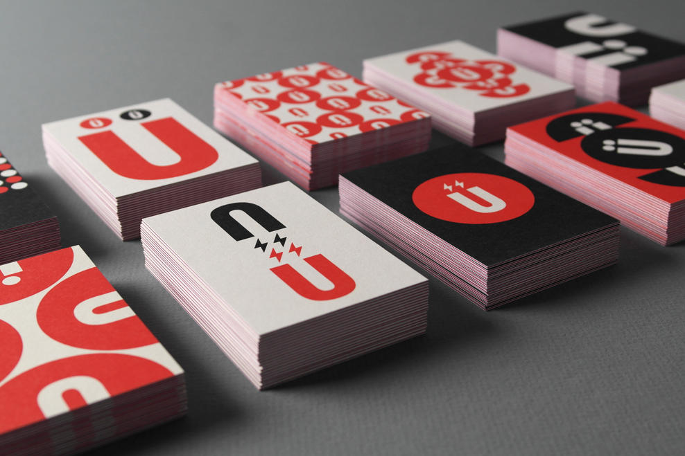
After years of designing better brands for everyone else, we felt it was time to better our own. Moving away from the textured, Russian Constructivist-look and more towards the Swiss, we distilled our identity down to its purest form: der Umlaut. Circles, dots and the Ü motif reconfigure into interlocking and repeat patterns creating a set of unique business and greeting card designs. Electric bolts echo the magnetic philosophy behind our Brand Attraction process. The full system reflects our flexible design aesthetic.
website: TRÜF Brand ID Refresh
