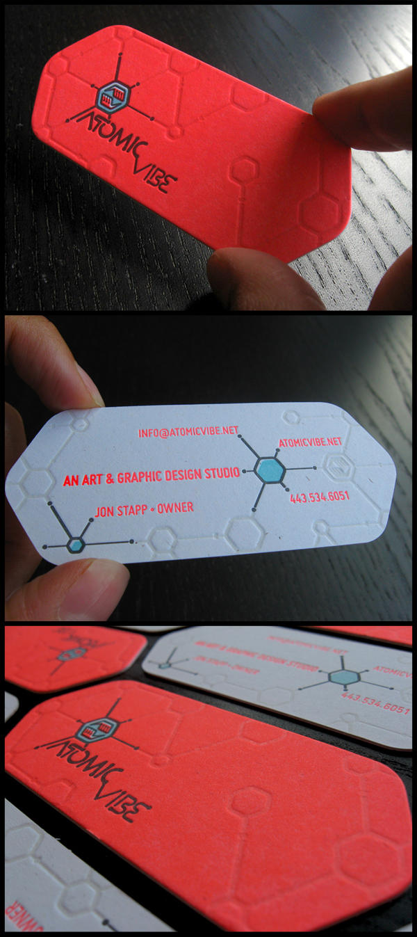
The visual identity established by the ATOMICvibe art and design studio was inspired by imagery from the Atomic Age, such as emerging science, the Space Race, Sputnik, and the iconic George Nelson Ball Clock, and these business cards were designed to compliment the overall aesthetic. ATOMICvibe is defined as the "a-HA!" moment of clarity in the creative process. Like nuclear fusion, it's when tiny ideas coalesce, and then explode into beautiful design. The logo visually depicts this creative reaction, as abstract A- & V-shaped hands converge upon the beginnings of a big idea, fusing them until they discharge a shockwave of creativity.
The design of the cards further emphasizes this scientific, nuclear-inspired theme by depicting elements that spring forth from an interconnected hexagonal pattern evocative of chemical equations or the visual representation of a chemical reaction. The extremely bright, red-orange fluorescence of Pantone 805 reinforces the nuclear fusion theme.
Featured on Under Consideration: For Print Only, Creattica, and soon to be printed in the upcoming book, 'Design and Design Book of the Year Volume 4.'
Technical specifications:
Size: 3.5" x 2" (just a bit shorter than a standard biz card)
Paper: French Poptone Starch White (has visible paper fibers in it) 140# cover weight paper.
Colors: 3 Pantone + spot varnish / 3 PMS + spot varnish. The Pantone
colors are: 805 (fluorescent orange-red), 629 (light blue), Black 7
(metallic black).
Finishing techniques: Custom die cut; Fronts and backs were printed
separately, then custom duplexed (glued together) for total weight of
280#.
